The versions of the the KissTies logo have been a quest for simplicity. We wanted to intuitively convey who we are from an icon. No holds were barred in the quest, nothing was too silly.
E&S, Edison & Susan, was our first logo back in 2009. KissTies was founded by Edison and Susan, and they wanted their names to represent their products. But then they learned that the name has already been trademarked. They had to have another brand name.

Edison & Susan logo
Susan came up with KissTies. "Kiss" was derived from several vantage points that ranged from the emotive (e.g. feelings evoked by a kiss), to the relational (e.g. who you would like to kiss), to the mundane (Keep It Short & Simple).
The resulting logo was a play on "Keep It Short and Simple" and "Ties" - the men's accessory. Like the first, It was a textual representation of our brand name. The letters were in different colors, reminiscent of the solid-color wedding ties that got us started in this business (see Our Story). The font was a Sans Serif, which means no extensions, as we wanted it simple and easy to read. It was also a representation of Edison's person and penmanship. The resulting text layout of KissTies with the K and T capitalized is now a standard feature in our brand. Trademarked in the U.S., it would now be presented in this layout in subsequent logo versions.

1st KissTies logo
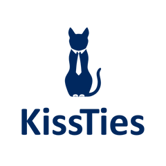
The current logo is the third iteration. It's the product of our desire to better represent KissTies' identity and aspirations. It bears the history of the trademarked KissTies layout. We also wanted to be represented by a cat. Cats are loving and caring, curious, playful, cuddly, adventurous, silly and goofy, smart and intelligent. And elegant. With its demeanor, it's quite hard to tell that it's actually the most successful predator in the world, able to survive even in the urban jungle. We also wanted it to readily show that we are a tie brand.
With the latest iteration, we wanted it to closely relate to our slogan "Ties With Your Beloved Ones", where "ties" is not just the fashion accessory but about relationships and gifting. "Kiss" is an imagery on expressing affection to loved ones. Because that's how we have meant KissTies to be, and that's the legacy - the inheritance - we would like to leave.
These were the entries:

After working on the new version for three months, we selected Zoltan's version.
Comments (0)
Back to Blogs